This post contains a simple function that creates formatted drift-diffusion plots using matplotlib in Python. Drift-diffusion plots show how something "drifts" between two bounds over time. They're commonly used to visualize how people reach decisions after accumulating information. Here's an example of a drift-diffusion plot showing the average "drift" of multiple trials or instances:

I wrote this function when I was analyzing data from one of my experiments. In the experiment, participants had to guess which of two options was correct based on a stream of incoming evidence. The drift-diffusion plots represented their guesses (ranging from 100% certain option A was correct to 100% certain option B was correct) over time.
You can view and download the Jupyter notebook I made to create the plots here.
First, we'll import libraries, define some formatting, and create some data to plot.
import pandas as pd
import numpy as np

import matplotlib.pyplot as plt
%matplotlib inline

#set font size of labels on matplotlib plots
plt.rc('font', size=16)

#define a custom palette
customPalette = ['#630C3A', '#39C8C6', '#D3500C', '#FFB139']
plt.rcParams['axes.prop_cycle'] = plt.cycler(color=customPalette)
t = 100   #number of timepoints
n = 20    #number of timeseries
bias = 0.1  #bias in random walk

#generate "biased random walk" timeseries
data = pd.DataFrame(np.reshape(np.cumsum(np.random.randn(t,n)+bias,axis=0),(t,n)))
data.head()
DRIFT-DIFFUSION PLOT FUNCTION
def drift_diffusion_plot(values, upperbound, lowerbound,
                         upperlabel='', lowerlabel='',
                         stickybounds=True, **kwargs):
    """
    Creates a formatted drift-diffusion plot for a given timeseries.

    Inputs:
       - values: array of values in timeseries
       - upperbound: numeric value of upper bound
       - lowerbound: numeric value of lower bound
       - upperlabel: optional label for upper bound
       - lowerlabel: optional label for lower bound
       - stickybounds: if true, timeseries stops when bound is hit
       - kwargs: https://matplotlib.org/api/_as_gen/matplotlib.pyplot.plot.html

    Output:
       - ax: handle to plot axis
    """

    #if bounds are sticky, hide timepoints that follow the first bound hit
    if stickybounds:
        #check to see if (and when) a bound was hit
        bound_hits = np.where((values>upperbound) | (values<lowerbound))[0]
        #if a bound was hit, replace subsequent values with NaN
        if len(bound_hits)>0:
            values = values.copy()
            values[bound_hits[0]+1:] = np.nan

    #plot timeseries
    ax = plt.gca()
    plt.plot(values, **kwargs)

    #format plot
    ax.set_ylim(lowerbound, upperbound)
    ax.set_yticks([lowerbound,upperbound])
    ax.set_yticklabels([lowerlabel,upperlabel])
    ax.axhline(y=np.mean([upperbound, lowerbound]), color='lightgray', zorder=0)
    ax.set_xlim(0,len(values))
    ax.set_xlabel('time')
    ax.spines['left'].set_visible(False)
    ax.spines['right'].set_visible(False)

    return ax
PLOT A SINGLE TIME SERIES WITHOUT STICKY BOUNDS
You can specify if the plot should have sticky bounds or not. Setting stickybounds=TRUE prevents the time series from moving away from a bound once it is reached. This is equivalent to forcing "decisions" to be final. Setting stickybounds=FALSE allows the time series to move away from a bound.
ax = drift_diffusion_plot(data.iloc[:,4], upperbound=10, lowerbound=-10,
                          upperlabel='Bound A ', lowerlabel='Bound B ',
                          stickybounds=False)

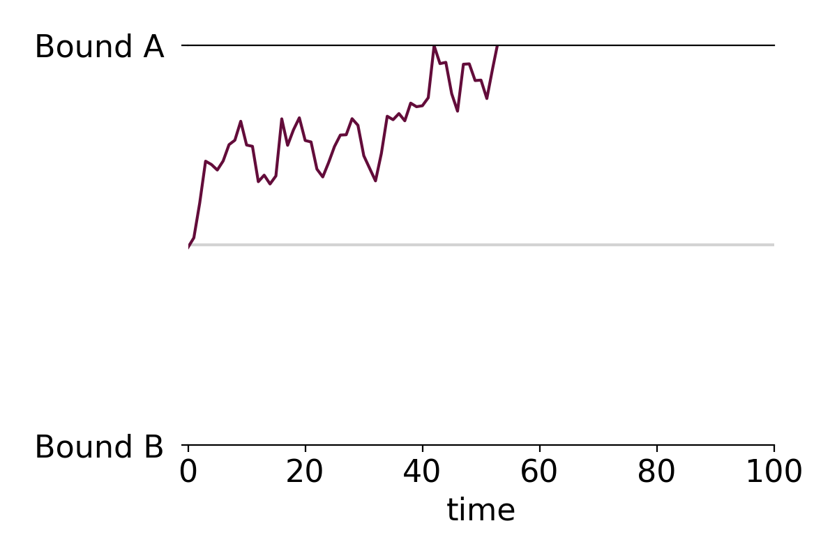
PLOT A SINGLE TIME SERIES WITH STICKY BOUNDS (DEFAULT)
ax = drift_diffusion_plot(data.iloc[:,4], upperbound=10, lowerbound=-10,
                          upperlabel='Bound A ', lowerlabel='Bound B ')
CUSTOMIZE FORMATTING
You can customize the plot in several ways. First, you can pass in any of the kwarg arguments accepted by Matplotlib in the drift_diffusion_plot function. Here's a list of arguments you can pass in. Second, the function returns a handle to the plot's axis that you can use to further adjust the formatting.
#you can pass in any of the kwargs that matplotlib accepts
ax = drift_diffusion_plot(data.iloc[:,4], upperbound=10, lowerbound=-10,
                          stickybounds=False,
                          lw=2.5, ls=':', color=customPalette[1])

#return the axis to make additional changes
ax.set_xlabel('');                   #remove x label
ax.set_xticks([0,31,59,90])          #adjust x ticks
ax.set_xticklabels(['Jan','Feb','Mar','Apr'], #change x tick labels
                   size=14, color='gray');
ax.set_yticklabels(['BUY ','SELL ']) #add y tick labels
ax.set_ylabel('price')               #add y label

PLOT MULTIPLE TIME SERIES AND OVERLAY THE MEAN
You can easily apply the function to multiple time series. For example, making a plot with all individual time series along with the mean time series takes only two lines of code:
#plot individual timeseries
data.apply(drift_diffusion_plot, upperbound=10, lowerbound=-10, color='black', alpha=0.2);
#plot mean timeseries
drift_diffusion_plot(np.mean(data, axis=1), upperbound=10, lowerbound=-10,
                     upperlabel='Bound A ', lowerlabel='Bound B ',
                     color='black', lw=3);

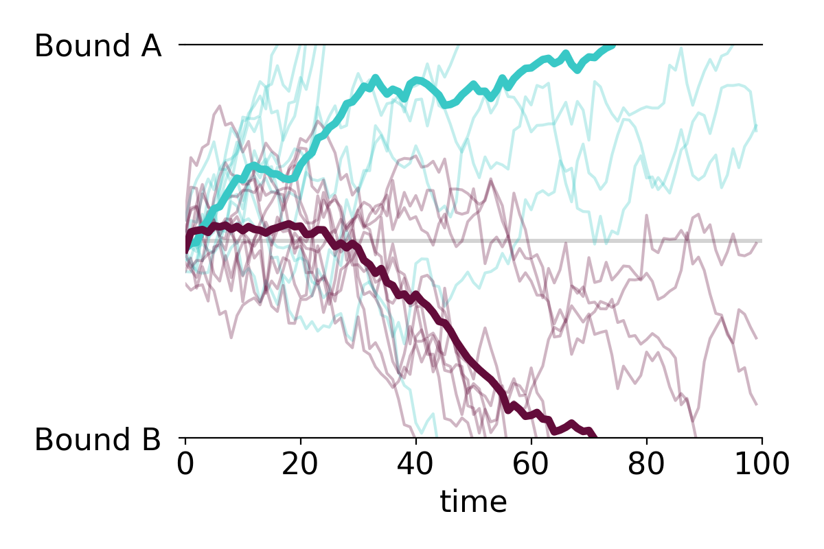
PLOT MULTIPLE GROUPS
We can also plot the individual time series in two or more color-coded groups.
n=10

#group 1 (positive drift)
data1 = pd.DataFrame(np.reshape(np.cumsum(np.random.randn(t,n)+bias,axis=0),(t,n)))
data1.apply(drift_diffusion_plot, upperbound=10, lowerbound=-10,
            color=customPalette[1], alpha=0.3);
drift_diffusion_plot(np.mean(data1, axis=1), upperbound=10, lowerbound=-10,
                     color=customPalette[1], lw=4, alpha=1);

#group 2 (negative drift)
data2 = pd.DataFrame(np.reshape(np.cumsum(np.random.randn(t,n)-bias,axis=0),(t,n)))
data2.apply(drift_diffusion_plot, upperbound=10, lowerbound=-10,
            color=customPalette[0], alpha=0.3);
drift_diffusion_plot(np.mean(data2, axis=1), upperbound=10, lowerbound=-10,
                     upperlabel='Bound A ', lowerlabel='Bound B ',
                     color=customPalette[0], lw=4, alpha=1);