After a quick Google search, I realize that there may not be such a thing as an arrow plot and I may have made up the term. Regardless of whether it's an actual type of plot or not, I've found them useful in visualizing changes in some variable across individuals and this post describes how to make them in Python.
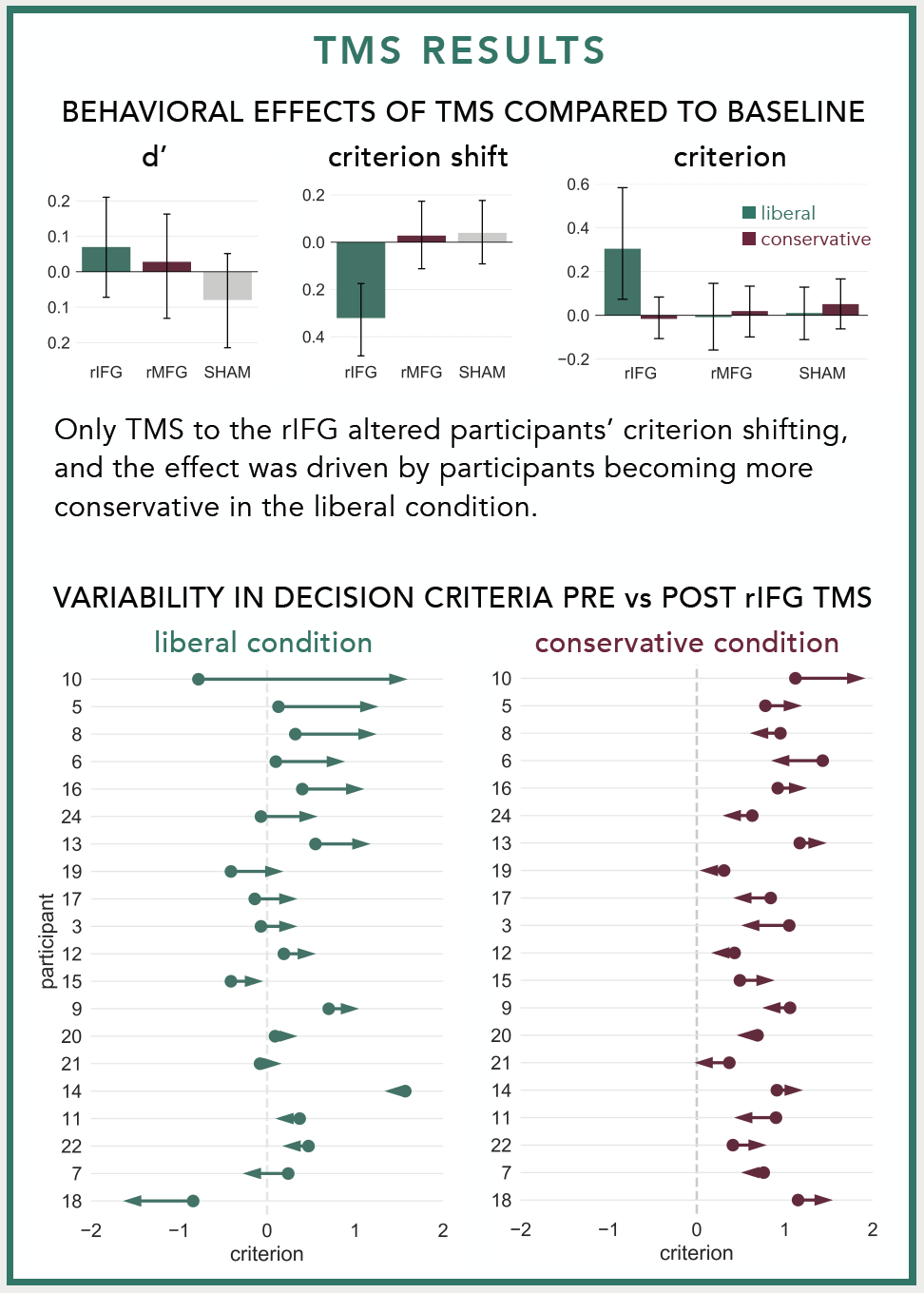
I first made the plot when I was trying to illustrate the variability in individuals' responses to neurostimulation. At the group level, our lab found that stimulating the right inferior frontal gyrus with repetitive Transcranial Magnetic Stimulation made participants more cautious to identify previously studied faces during a recognition memory experiment. We only observed this pattern in one condition and I wanted to visualize how participants' decision criteria changed before vs. after TMS in each condition. Normally I would use a strip plot with different colored points for before vs. after stimulation, but I thought replacing the points with an arrow pointed in the direction of the change would make for a simpler, more intuitive plot. Here's what the arrow plots looked like in the poster:
The dots in the arrow plots denote the participants' decision criteria before stimulation and the tip of the arrow heads denote their decision criteria after stimulation.
I use these plots often to visualize changes in participants' behaviors before vs. after neurostimulation, but they can be used in any situation where you need to illustrate how some variable changed among different entities. For example, you could use them to show how population changed among different US states, how mean salaries changed among different occupations, or how stock prices changed among different corporations.
You can view and download the Jupyter notebook I made to create the plots here.
First, we'll import libraries, define some formatting, and create some data to plot.
import pandas as pd
import numpy as np

import seaborn as sns
import matplotlib.pyplot as plt
import matplotlib.colors
%matplotlib inline

#set font size of labels on matplotlib plots
plt.rc('font', size=16)

#set style of plots
sns.set_style('white')
n = 30 #number of subjects

#create dataframe
data = pd.DataFrame(columns=['subject','before','after','change'], index=range(n))
data.loc[:,'subject'] = range(n)
data.loc[:,'before'] = np.random.normal(0, 0.5, n)
data.loc[:,'after'] = np.random.normal(0.25, 0.5, n)
data.loc[:,'change'] = data['after'] - data['before']

data.head()
ARROW PLOT 1: BEFORE vs. AFTER VALUES
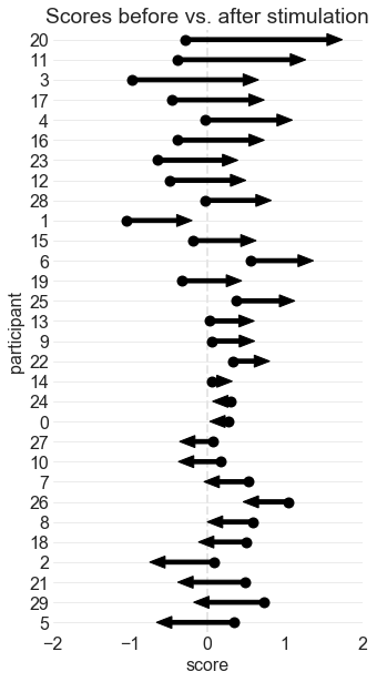
This is the same arrow plot I made for the ICB poster. The arrows start at the "before score" and end at the "after score." The participants are sorted according to how much their scores changed.
#sort individuals by amount of change, from largest to smallest
data = data.sort_values(by='change', ascending=False) \
           .reset_index(drop=True)

#initialize a plot
ax = plt.figure(figsize=(5,10))

#add start points
ax = sns.stripplot(data=data,
                   x='before',
                   y='subject',
                   orient='h',
                   order=data['subject'],
                   size=10,
                   color='black')

#define arrows
arrow_starts = data['before'].values
arrow_lengths = data['after'].values - arrow_starts

#add arrows to plot
for i, subject in enumerate(data['subject']):
    ax.arrow(arrow_starts[i],        #x start point
             i,                      #y start point
             arrow_lengths[i],       #change in x
             0,                      #change in y
             head_width=0.6,         #arrow head width
             head_length=0.2,        #arrow head length
             width=0.2,              #arrow stem width
             fc='black',             #arrow fill color
             ec='black')             #arrow edge color

#format plot
ax.set_title('Scores before vs. after stimulation')   #add title
ax.axvline(x=0, color='0.9', ls='--', lw=2, zorder=0) #add line at x=0
ax.grid(axis='y', color='0.9')                        #add a light grid
ax.set_xlim(-2,2)                                     #set x axis limits
ax.set_xlabel('score')                                #label the x axis
ax.set_ylabel('participant')                          #label the y axis
sns.despine(left=True, bottom=True)                   #remove axes
ARROW PLOT 2: NORMALIZED CHANGES
This plot visualizes the change in scores, and not the scores themselves. It's effective if you want to emphasize the magnitude of change, and not the actual start points or end points. It looks cleaner, but it also conveys less information.
#sort individuals by amount of change, from largest to smallest
data = data.sort_values(by='change', ascending=True) \
           .reset_index(drop=True)

#initialize a plot
fig, ax = plt.subplots(figsize=(5,10))
ax.set_xlim(-1.5,1.5)
ax.set_ylim(-1,n)
ax.set_yticks(range(n))
ax.set_yticklabels(data['subject'])

#define arrows
arrow_starts = np.repeat(0,n)
arrow_lengths = data['change'].values

#add arrows to plot
for i, subject in enumerate(data['subject']):
    ax.arrow(arrow_starts[i],        #x start point
             i,                      #y start point
             arrow_lengths[i],       #change in x
             0,                      #change in y
             head_width=0.6,         #arrow head width
             head_length=0.2,        #arrow head length
             width=0.2,              #arrow stem width
             fc='black',             #arrow fill color
             ec='black')             #arrow edge color

#format plot
ax.set_title('Changes in scores')                     #add title
ax.axvline(x=0, color='0.9', ls='--', lw=2, zorder=0) #add line at x=0
ax.grid(axis='y', color='0.9')                        #add a light grid
ax.set_xlim(-2,2)                                     #set x axis limits
ax.set_xlabel('change')                               #label the x axis
ax.set_ylabel('participant')                          #label the y axis
sns.despine(left=True, bottom=True)                   #remove axes
ARROW PLOT 3: COLOR-CODED ARROWS
You can also color-code the arrows to illustrate positive or negative change:
#sort individuals by amount of change, from largest to smallest
data = data.sort_values(by='change', ascending=True) \
           .reset_index(drop=True)

#initialize a plot
fig, ax = plt.subplots(figsize=(5,10))   #create figure
ax.set_xlim(-2,2)                        #set x axis limits
ax.set_ylim(-1,n)                        #set y axis limits
ax.set_yticks(range(n))                  #add 0-n ticks
ax.set_yticklabels(data['subject'])      #add y tick labels

#define arrows
arrow_starts = np.repeat(0,n)
arrow_lengths = data['change'].values

#add arrows to plot
for i, subject in enumerate(data['subject']):

    if arrow_lengths[i] > 0:
        arrow_color = '#347768'
    elif arrow_lengths[i] < 0:
        arrow_color = '#6B273D'
    else:
        arrow_color = 'black'

    ax.arrow(arrow_starts[i],        #x start point
             i,                      #y start point
             arrow_lengths[i],       #change in x
             0,                      #change in y
             head_width=0.6,         #arrow head width
             head_length=0.2,        #arrow head length
             width=0.2,              #arrow stem width
             fc=arrow_color,             #arrow fill color
             ec=arrow_color)             #arrow edge color

#format plot
ax.set_title('Changes in scores')                     #add title
ax.axvline(x=0, color='0.9', ls='--', lw=2, zorder=0) #add line at x=0
ax.grid(axis='y', color='0.9')                        #add a light grid
ax.set_xlim(-2,2)                                     #set x axis limits
ax.set_xlabel('change')                               #label the x axis
ax.set_ylabel('participant')                          #label the y axis
sns.despine(left=True, bottom=True)                   #remove axes


