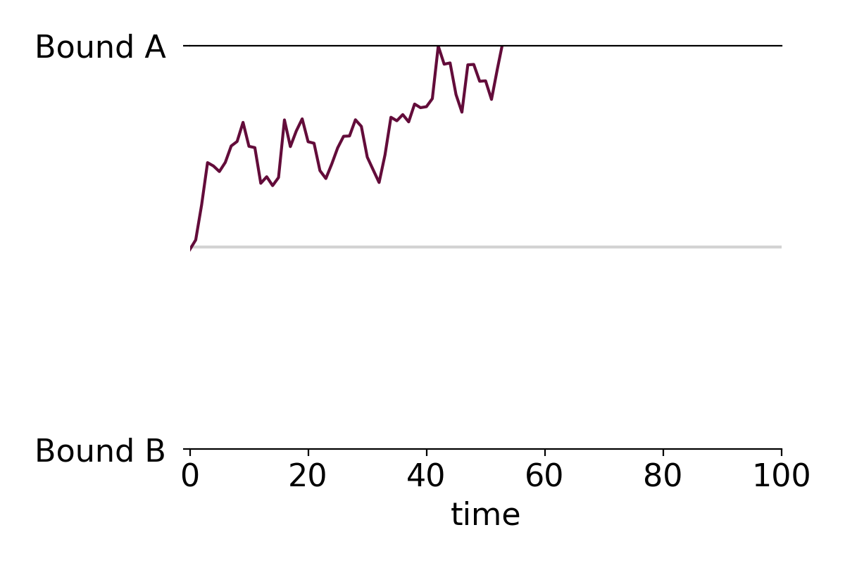
This post contains a simple function that creates formatted drift-diffusion plots using matplotlib in Python. Drift-diffusion plots show how something "drifts" between two bounds over time. They're commonly used to visualize how people reach decisions after accumulating information. Here's an example of a drift-diffusion plot showing the average "drift" of multiple trials or instances:

I wrote this function when I was analyzing data from one of my experiments. In the experiment, participants had to guess which of two options was correct based on a stream of incoming evidence. The drift-diffusion plots represented their guesses (ranging from 100% certain option A was correct to 100% certain option B was correct) over time.
You can view and download the Jupyter notebook I made to create the plots here.
First, we'll import libraries, define some formatting, and create some data to plot.
import pandas as pd
import numpy as np

import matplotlib.pyplot as plt
%matplotlib inline

#set font size of labels on matplotlib plots
plt.rc('font', size=16)

#define a custom palette
customPalette = ['#630C3A', '#39C8C6', '#D3500C', '#FFB139']
plt.rcParams['axes.prop_cycle'] = plt.cycler(color=customPalette)
t = 100   #number of timepoints
n = 20    #number of timeseries
bias = 0.1  #bias in random walk

#generate "biased random walk" timeseries
data = pd.DataFrame(np.reshape(np.cumsum(np.random.randn(t,n)+bias,axis=0),(t,n)))
data.head()
DRIFT-DIFFUSION PLOT FUNCTION
def drift_diffusion_plot(values, upperbound, lowerbound,
                         upperlabel='', lowerlabel='',
                         stickybounds=True, **kwargs):
    """
    Creates a formatted drift-diffusion plot for a given timeseries.

    Inputs:
       - values: array of values in timeseries
       - upperbound: numeric value of upper bound
       - lowerbound: numeric value of lower bound
       - upperlabel: optional label for upper bound
       - lowerlabel: optional label for lower bound
       - stickybounds: if true, timeseries stops when bound is hit
       - kwargs: https://matplotlib.org/api/_as_gen/matplotlib.pyplot.plot.html

    Output:
       - ax: handle to plot axis
    """

    #if bounds are sticky, hide timepoints that follow the first bound hit
    if stickybounds:
        #check to see if (and when) a bound was hit
        bound_hits = np.where((values>upperbound) | (values<lowerbound))[0]
        #if a bound was hit, replace subsequent values with NaN
        if len(bound_hits)>0:
            values = values.copy()
            values[bound_hits[0]+1:] = np.nan

    #plot timeseries
    ax = plt.gca()
    plt.plot(values, **kwargs)

    #format plot
    ax.set_ylim(lowerbound, upperbound)
    ax.set_yticks([lowerbound,upperbound])
    ax.set_yticklabels([lowerlabel,upperlabel])
    ax.axhline(y=np.mean([upperbound, lowerbound]), color='lightgray', zorder=0)
    ax.set_xlim(0,len(values))
    ax.set_xlabel('time')
    ax.spines['left'].set_visible(False)
    ax.spines['right'].set_visible(False)

    return ax
PLOT A SINGLE TIME SERIES WITHOUT STICKY BOUNDS
You can specify if the plot should have sticky bounds or not. Setting stickybounds=TRUE prevents the time series from moving away from a bound once it is reached. This is equivalent to forcing "decisions" to be final. Setting stickybounds=FALSE allows the time series to move away from a bound.
ax = drift_diffusion_plot(data.iloc[:,4], upperbound=10, lowerbound=-10,
                          upperlabel='Bound A ', lowerlabel='Bound B ',
                          stickybounds=False)

PLOT A SINGLE TIME SERIES WITH STICKY BOUNDS (DEFAULT)
ax = drift_diffusion_plot(data.iloc[:,4], upperbound=10, lowerbound=-10,
                          upperlabel='Bound A ', lowerlabel='Bound B ')
CUSTOMIZE FORMATTING
You can customize the plot in several ways. First, you can pass in any of the kwarg arguments accepted by Matplotlib in the drift_diffusion_plot function. Here's a list of arguments you can pass in. Second, the function returns a handle to the plot's axis that you can use to further adjust the formatting.
#you can pass in any of the kwargs that matplotlib accepts
ax = drift_diffusion_plot(data.iloc[:,4], upperbound=10, lowerbound=-10,
                          stickybounds=False,
                          lw=2.5, ls=':', color=customPalette[1])

#return the axis to make additional changes
ax.set_xlabel('');                   #remove x label
ax.set_xticks([0,31,59,90])          #adjust x ticks
ax.set_xticklabels(['Jan','Feb','Mar','Apr'], #change x tick labels
                   size=14, color='gray');
ax.set_yticklabels(['BUY ','SELL ']) #add y tick labels
ax.set_ylabel('price')               #add y label

PLOT MULTIPLE TIME SERIES AND OVERLAY THE MEAN
You can easily apply the function to multiple time series. For example, making a plot with all individual time series along with the mean time series takes only two lines of code:
#plot individual timeseries
data.apply(drift_diffusion_plot, upperbound=10, lowerbound=-10, color='black', alpha=0.2);
#plot mean timeseries
drift_diffusion_plot(np.mean(data, axis=1), upperbound=10, lowerbound=-10,
                     upperlabel='Bound A ', lowerlabel='Bound B ',
                     color='black', lw=3);

PLOT MULTIPLE GROUPS
We can also plot the individual time series in two or more color-coded groups.
n=10

#group 1 (positive drift)
data1 = pd.DataFrame(np.reshape(np.cumsum(np.random.randn(t,n)+bias,axis=0),(t,n)))
data1.apply(drift_diffusion_plot, upperbound=10, lowerbound=-10,
            color=customPalette[1], alpha=0.3);
drift_diffusion_plot(np.mean(data1, axis=1), upperbound=10, lowerbound=-10,
                     color=customPalette[1], lw=4, alpha=1);

#group 2 (negative drift)
data2 = pd.DataFrame(np.reshape(np.cumsum(np.random.randn(t,n)-bias,axis=0),(t,n)))
data2.apply(drift_diffusion_plot, upperbound=10, lowerbound=-10,
            color=customPalette[0], alpha=0.3);
drift_diffusion_plot(np.mean(data2, axis=1), upperbound=10, lowerbound=-10,
                     upperlabel='Bound A ', lowerlabel='Bound B ',
                     color=customPalette[0], lw=4, alpha=1);
How to make arrow plots that visualize change
After a quick Google search, I realize that there may not be such a thing as an arrow plot and I may have made up the term. Regardless of whether it's an actual type of plot or not, I've found them useful in visualizing changes in some variable across individuals and this post describes how to make them in Python.
I first made the plot when I was trying to illustrate the variability in individuals' responses to neurostimulation. At the group level, our lab found that stimulating the right inferior frontal gyrus with repetitive Transcranial Magnetic Stimulation made participants more cautious to identify previously studied faces during a recognition memory experiment. We only observed this pattern in one condition and I wanted to visualize how participants' decision criteria changed before vs. after TMS in each condition. Normally I would use a strip plot with different colored points for before vs. after stimulation, but I thought replacing the points with an arrow pointed in the direction of the change would make for a simpler, more intuitive plot. Here's what the arrow plots looked like in the poster:
The dots in the arrow plots denote the participants' decision criteria before stimulation and the tip of the arrow heads denote their decision criteria after stimulation.
I use these plots often to visualize changes in participants' behaviors before vs. after neurostimulation, but they can be used in any situation where you need to illustrate how some variable changed among different entities. For example, you could use them to show how population changed among different US states, how mean salaries changed among different occupations, or how stock prices changed among different corporations.
You can view and download the Jupyter notebook I made to create the plots here.
First, we'll import libraries, define some formatting, and create some data to plot.
import pandas as pd
import numpy as np

import seaborn as sns
import matplotlib.pyplot as plt
import matplotlib.colors
%matplotlib inline

#set font size of labels on matplotlib plots
plt.rc('font', size=16)

#set style of plots
sns.set_style('white')
n = 30 #number of subjects

#create dataframe
data = pd.DataFrame(columns=['subject','before','after','change'], index=range(n))
data.loc[:,'subject'] = range(n)
data.loc[:,'before'] = np.random.normal(0, 0.5, n)
data.loc[:,'after'] = np.random.normal(0.25, 0.5, n)
data.loc[:,'change'] = data['after'] - data['before']

data.head()
ARROW PLOT 1: BEFORE vs. AFTER VALUES
This is the same arrow plot I made for the ICB poster. The arrows start at the "before score" and end at the "after score." The participants are sorted according to how much their scores changed.
#sort individuals by amount of change, from largest to smallest
data = data.sort_values(by='change', ascending=False) \
           .reset_index(drop=True)

#initialize a plot
ax = plt.figure(figsize=(5,10))

#add start points
ax = sns.stripplot(data=data,
                   x='before',
                   y='subject',
                   orient='h',
                   order=data['subject'],
                   size=10,
                   color='black')

#define arrows
arrow_starts = data['before'].values
arrow_lengths = data['after'].values - arrow_starts

#add arrows to plot
for i, subject in enumerate(data['subject']):
    ax.arrow(arrow_starts[i],        #x start point
             i,                      #y start point
             arrow_lengths[i],       #change in x
             0,                      #change in y
             head_width=0.6,         #arrow head width
             head_length=0.2,        #arrow head length
             width=0.2,              #arrow stem width
             fc='black',             #arrow fill color
             ec='black')             #arrow edge color

#format plot
ax.set_title('Scores before vs. after stimulation')   #add title
ax.axvline(x=0, color='0.9', ls='--', lw=2, zorder=0) #add line at x=0
ax.grid(axis='y', color='0.9')                        #add a light grid
ax.set_xlim(-2,2)                                     #set x axis limits
ax.set_xlabel('score')                                #label the x axis
ax.set_ylabel('participant')                          #label the y axis
sns.despine(left=True, bottom=True)                   #remove axes
ARROW PLOT 2: NORMALIZED CHANGES
This plot visualizes the change in scores, and not the scores themselves. It's effective if you want to emphasize the magnitude of change, and not the actual start points or end points. It looks cleaner, but it also conveys less information.
#sort individuals by amount of change, from largest to smallest
data = data.sort_values(by='change', ascending=True) \
           .reset_index(drop=True)

#initialize a plot
fig, ax = plt.subplots(figsize=(5,10))
ax.set_xlim(-1.5,1.5)
ax.set_ylim(-1,n)
ax.set_yticks(range(n))
ax.set_yticklabels(data['subject'])

#define arrows
arrow_starts = np.repeat(0,n)
arrow_lengths = data['change'].values

#add arrows to plot
for i, subject in enumerate(data['subject']):
    ax.arrow(arrow_starts[i],        #x start point
             i,                      #y start point
             arrow_lengths[i],       #change in x
             0,                      #change in y
             head_width=0.6,         #arrow head width
             head_length=0.2,        #arrow head length
             width=0.2,              #arrow stem width
             fc='black',             #arrow fill color
             ec='black')             #arrow edge color

#format plot
ax.set_title('Changes in scores')                     #add title
ax.axvline(x=0, color='0.9', ls='--', lw=2, zorder=0) #add line at x=0
ax.grid(axis='y', color='0.9')                        #add a light grid
ax.set_xlim(-2,2)                                     #set x axis limits
ax.set_xlabel('change')                               #label the x axis
ax.set_ylabel('participant')                          #label the y axis
sns.despine(left=True, bottom=True)                   #remove axes
ARROW PLOT 3: COLOR-CODED ARROWS
You can also color-code the arrows to illustrate positive or negative change:
#sort individuals by amount of change, from largest to smallest
data = data.sort_values(by='change', ascending=True) \
           .reset_index(drop=True)

#initialize a plot
fig, ax = plt.subplots(figsize=(5,10))   #create figure
ax.set_xlim(-2,2)                        #set x axis limits
ax.set_ylim(-1,n)                        #set y axis limits
ax.set_yticks(range(n))                  #add 0-n ticks
ax.set_yticklabels(data['subject'])      #add y tick labels

#define arrows
arrow_starts = np.repeat(0,n)
arrow_lengths = data['change'].values

#add arrows to plot
for i, subject in enumerate(data['subject']):

    if arrow_lengths[i] > 0:
        arrow_color = '#347768'
    elif arrow_lengths[i] < 0:
        arrow_color = '#6B273D'
    else:
        arrow_color = 'black'

    ax.arrow(arrow_starts[i],        #x start point
             i,                      #y start point
             arrow_lengths[i],       #change in x
             0,                      #change in y
             head_width=0.6,         #arrow head width
             head_length=0.2,        #arrow head length
             width=0.2,              #arrow stem width
             fc=arrow_color,             #arrow fill color
             ec=arrow_color)             #arrow edge color

#format plot
ax.set_title('Changes in scores')                     #add title
ax.axvline(x=0, color='0.9', ls='--', lw=2, zorder=0) #add line at x=0
ax.grid(axis='y', color='0.9')                        #add a light grid
ax.set_xlim(-2,2)                                     #set x axis limits
ax.set_xlabel('change')                               #label the x axis
ax.set_ylabel('participant')                          #label the y axis
sns.despine(left=True, bottom=True)                   #remove axes
7 ways to label a cluster plot in Python
This tutorial shows you 7 different ways to label a scatter plot with different groups (or clusters) of data points. I made the plots using the Python packages matplotlib and seaborn, but you could reproduce them in any software. These labeling methods are useful to represent the results of clustering algorithms, such as k-means clustering, or when your data is divided up into groups that tend to cluster together.
Here's a sneak peek of some of the plots:

You can access the Juypter notebook I used to create the plots here. I also embedded the code below.
First, we need to import a few libraries and define some basic formatting:
import pandas as pd
import numpy as np

import seaborn as sns
import matplotlib.pyplot as plt
%matplotlib inline

#set font size of labels on matplotlib plots
plt.rc('font', size=16)

#set style of plots
sns.set_style('white')

#define a custom palette
customPalette = ['#630C3A', '#39C8C6', '#D3500C', '#FFB139']
sns.set_palette(customPalette)
sns.palplot(customPalette)
CREATE LABELED GROUPS OF DATA
Next, we need to generate some data to plot. I defined four groups (A, B, C, and D) and specified their center points. For each label, I sampled nx2 data points from a gaussian distribution centered at the mean of the group and with a standard deviation of 0.5.
To make these plots, each datapoint needs to be assigned a label. If your data isn't labeled, you can use a clustering algorithm to create artificial groups.
#number of points per group
n = 50

#define group labels and their centers
groups = {'A': (2,2),
          'B': (3,4),
          'C': (4,4),
          'D': (4,1)}

#create labeled x and y data
data = pd.DataFrame(index=range(n*len(groups)), columns=['x','y','label'])
for i, group in enumerate(groups.keys()):
    #randomly select n datapoints from a gaussian distrbution
    data.loc[i*n:((i+1)*n)-1,['x','y']] = np.random.normal(groups[group],
                                                           [0.5,0.5],
                                                           [n,2])
    #add group labels
    data.loc[i*n:((i+1)*n)-1,['label']] = group

data.head()

STYLE 1: STANDARD LEGEND
Seaborn makes it incredibly easy to generate a nice looking labeled scatter plot. This style works well if your data points are labeled, but don't really form clusters, or if your labels are long.
#plot data with seaborn
facet = sns.lmplot(data=data, x='x', y='y', hue='label',
                   fit_reg=False, legend=True, legend_out=True)

STYLE 2: COLOR-CODED LEGEND
This is a slightly fancier version of style 1 where the text labels in the legend are also color-coded. I like using this option when I have longer labels. When I'm going for a minimal look, I'll drop the colored bullet points in the legend and only keep the colored text.
#plot data with seaborn (don't add a legend yet)
facet = sns.lmplot(data=data, x='x', y='y', hue='label',
                   fit_reg=False, legend=False)

#add a legend
leg = facet.ax.legend(bbox_to_anchor=[1, 0.75],
                         title="label", fancybox=True)
#change colors of labels
for i, text in enumerate(leg.get_texts()):
    plt.setp(text, color = customPalette[i])

STYLE 3: COLOR-CODED TITLE
This option can work really well in some contexts, but poorly in others. It probably isn't a good option if you have a lot of group labels or the group labels are very long. However, if you have only 2 or 3 labels, it can make for a clean and stylish option. I would use this type of labeling in a presentation or in a blog post, but I probably wouldn't use in more formal contexts like an academic paper.
#plot data with seaborn
facet = sns.lmplot(data=data, x='x', y='y', hue='label',
                   fit_reg=False, legend=False)

#define padding -- higher numbers will move title rightward
pad = 4.5

#define separation between cluster labels
sep = 0.3

#define y position of title
y = 5.6

#add beginning of title in black
facet.ax.text(pad, y, 'Distributions of points in clusters:',
              ha='right', va='bottom', color='black')

#add color-coded cluster labels
for i, label in enumerate(groups.keys()):
    text = facet.ax.text(pad+((i+1)*sep), y, label,
                         ha='right', va='bottom',
                         color=customPalette[i])

STYLE 4: LABELS NEXT TO CLUSTERS
This is my favorite style and the labeling scheme I use most often. I generally like to place labels next to the data instead of in a legend. The only draw back of this labeling scheme is that you need to hard code where you want the labels to be positioned.
#define labels and where they should go
labels = {'A': (1.25,1),
          'B': (2.25,4.5),
          'C': (4.75,3.5),
          'D': (4.75,1.5)}

#create a new figure
plt.figure(figsize=(5,5))

#loop through labels and plot each cluster
for i, label in enumerate(groups.keys()):

    #add data points
    plt.scatter(x=data.loc[data['label']==label, 'x'],
                y=data.loc[data['label']==label,'y'],
                color=customPalette[i],
                alpha=0.7)

    #add label
    plt.annotate(label,
                 labels[label],
                 horizontalalignment='center',
                 verticalalignment='center',
                 size=20, weight='bold',
                 color=customPalette[i])

STYLE 5: LABELS CENTERED ON CLUSTER MEANS
This style is advantageous if you care more about where the cluster means are than the locations of the individual points. I made the points more transparent to improve the visibility of the labels.
#create a new figure
plt.figure(figsize=(5,5))

#loop through labels and plot each cluster
for i, label in enumerate(groups.keys()):

    #add data points
    plt.scatter(x=data.loc[data['label']==label, 'x'],
                y=data.loc[data['label']==label,'y'],
                color=customPalette[i],
                alpha=0.20)

    #add label
    plt.annotate(label,
                 data.loc[data['label']==label,['x','y']].mean(),
                 horizontalalignment='center',
                 verticalalignment='center',
                 size=20, weight='bold',
                 color=customPalette[i])

STYLE 6: LABELS CENTERED ON CLUSTER MEANS (2)
This style is similar to style 5, but relies on a different way to improve label visibility. Here, the background of the labels are color-coded and the text is white.
#create a new figure
plt.figure(figsize=(5,5))

#loop through labels and plot each cluster
for i, label in enumerate(groups.keys()):

    #add data points
    plt.scatter(x=data.loc[data['label']==label, 'x'],
                y=data.loc[data['label']==label,'y'],
                color=customPalette[i],
                alpha=1)

    #add label
    plt.annotate(label,
                 data.loc[data['label']==label,['x','y']].mean(),
                 horizontalalignment='center',
                 verticalalignment='center',
                 size=20, weight='bold',
                 color='white',
                 backgroundcolor=customPalette[i])

STYLE 7: TEXT MARKERS
This style is a little bit odd, but it can be effective in some situations. This type of labeling scheme may be useful when there are few data points and the labels are very short.
#create a new figure and set the x and y limits
fig, axes = plt.subplots(figsize=(5,5))
axes.set_xlim(0.5,5.5)
axes.set_ylim(-0.5,5.5)

#loop through labels and plot each cluster
for i, label in enumerate(groups.keys()):

    #loop through data points and plot each point
    for l, row in data.loc[data['label']==label,:].iterrows():

        #add the data point as text
        plt.annotate(row['label'],
                     (row['x'], row['y']),
                     horizontalalignment='center',
                     verticalalignment='center',
                     size=11,
                     color=customPalette[i])

How to assign different colors to different conditions in Excel graphs
This post was originally published on May 12, 2014.
Excel is a great program to use if you don’t require complicated graphs and if you use their default formatting (which you shouldn’t!). However, if you need more advanced formatting, making graphs in Excel can become complicated. It’s not impossible though — there are ways to manipulate Excel to create beautiful, custom charts.
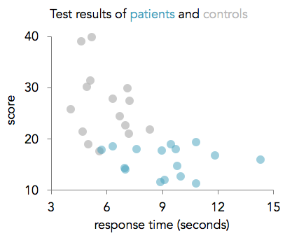
In this tutorial, I describe how to conditionally format graphs in Excel. Conditional formatting is useful when you have two or more conditions that you want to format differently. For example, if you have data from a patient group and a control group and you want to display their data in different colors, sizes, or shapes. Excel does let you format data points individually, but applying the same format to every data point in each condition can quickly become labor intensive. Here's an example where two groups of participants are labeled with different colors:

STEP 1: ORGANIZE YOUR DATA
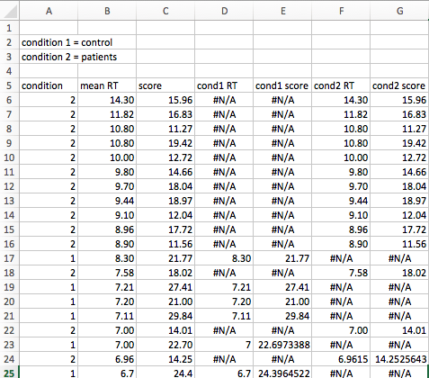
To begin, organize all your data in columns. The first column should contain dummy codes for your different conditions. For example, if you have three conditions, you’ll use the numbers 1,2, and 3 to represent your conditions. The remaining columns should contain your variables that you plan to plot — you should have two columns if you want to make a scatter chart and one column if you are making a bar chart or something similar. In this example, I have two groups: a control group, which I dummy coded with 1, and a patient group, which I dummy coded with 2. Each subject has a response time that is listed in column B:

STEP 2: SEPARATE DATA ACCORDING TO CONDITION TYPE
This step includes the meat of the tutorial. First, create new columns for each condition type and each variable (if you have 2 conditions and 1 variable, you’ll need 2 new columns and if you have 3 conditions and 2 variables, you’ll need 6 new columns). In each column, type an IF statement with the following parameters:
=IF(condition = dummy code, variable, NA() )
where "condition" is the cell containing your dummy code, "dummy code" is the actual number of your dummy coding (this number will change in each column), and "variable" is the cell containing your data. So in our example, we’ll use the following IF statements:
In the first new column: =IF(A6=1,B6,NA())
In the second new column: =IF(A6=2,B6,NA())
Finally, apply the formatting to all your data by highlighting the cells containing your IF statements and dragging the blue box in the lower righthand corner all the way down to the end of your data.

STEP 3: CREATE A GRAPH
At this point, you can create whatever type of graph you need — this conditional formatting technique can be used to create a wide variety of graphs. In this example, I created a simple bar chart to visualize subjects’ response times according to condition type.
To create a bar chart, click on the charts tab in the Excel ribbon. Highlight the data in the new columns you just created (the columns with the #N/A values), click on the Bar icon, and select clustered bar chart. Now when you click on a datapoint in the graph, it will highlight all of the other datapoints that belong to the same condition. You can format the datapoints in each condition separately.

To make the spacing of the bars uniform, right click on the data series and select format data series. Change the overlap to 100% and the gap width to 100%. To finish formatting, I removed the gridlines, added a title and and x axis label, changed the typeface of the axes and labels to Avenir, changed the color of the bars to a neutral gray for the controls and a teal for the patients, and removed all shadows and other special effects. I also removed the y-axis labels since the subject number does not matter in this case. Here’s the finished graph:

You can use the same conditional formatting technique to create scatter plots too. Here's an example of how to set up the data:
And here's what the formatted scatter plot looks like: