design

Classy navy and coral poster template

I made this poster for the Cognitive Neuroscience Society conference in 2015. This poster summarizes a follow-up analysis of my first-year fMRI project. We estimated the certainty and expectedness associated with the stimuli used in the experiment and investigated which brain areas tracked hypothesis certainty and evidence expectancy over time. 

As with most posters, I started with a color scheme that I pulled from Pinterest. The color scheme I chose for this poster consisted of navy, coral, slate gray, and tan (which I ended up dropping):

color_scheme.png

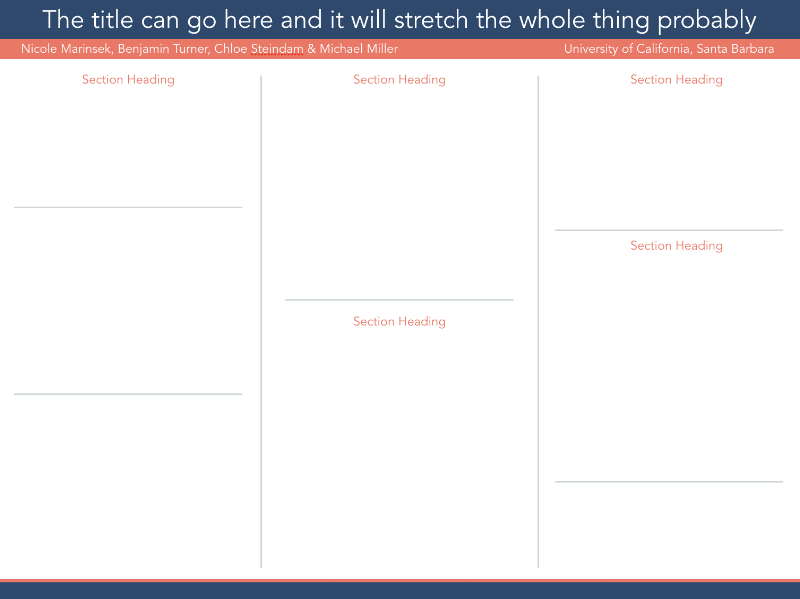
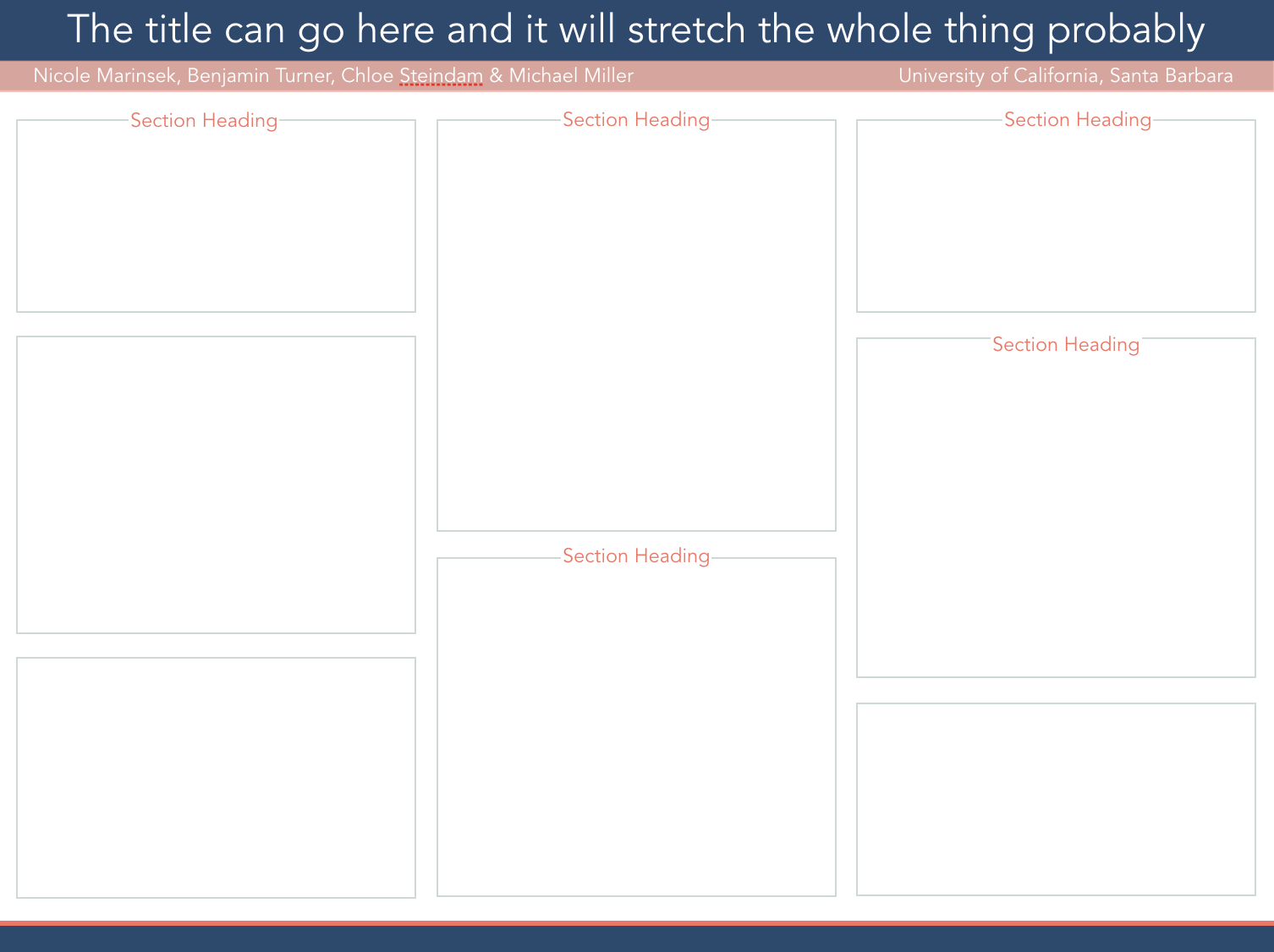
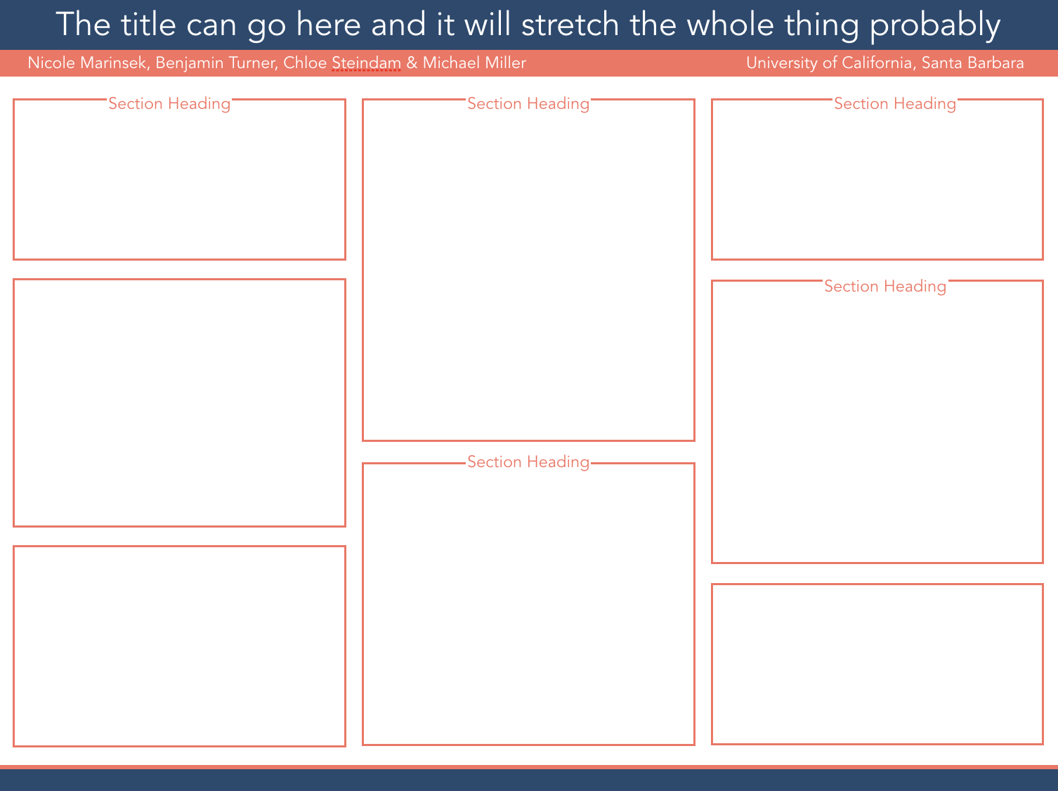
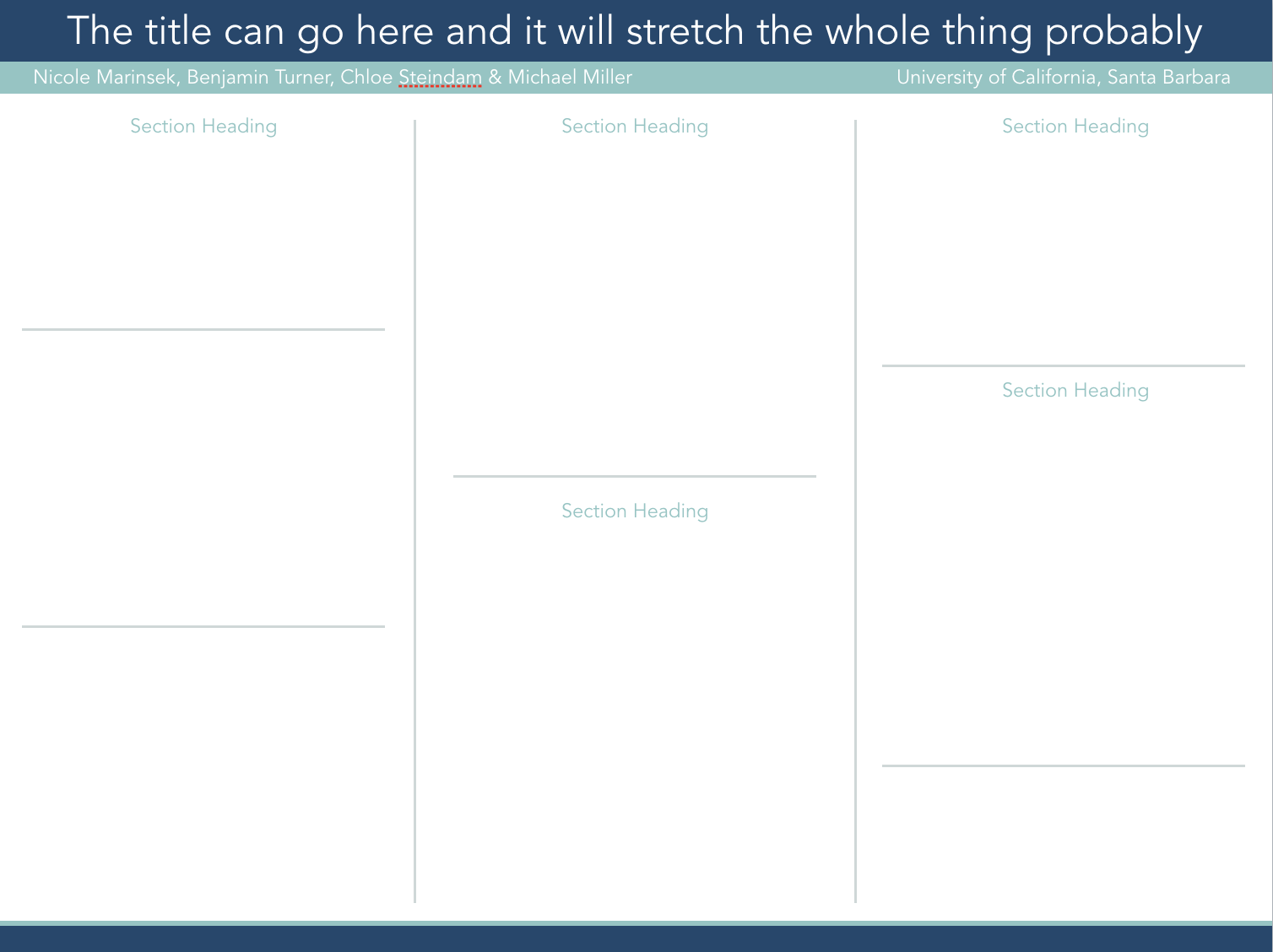
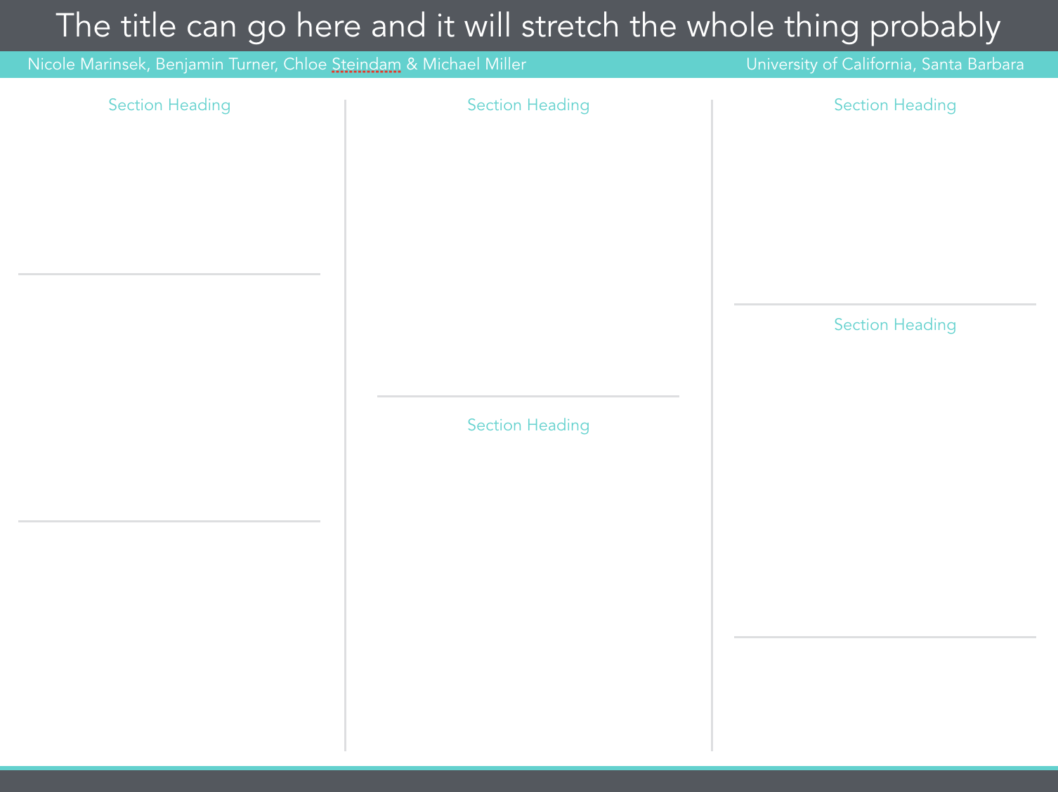
For this poster, I wanted to go for a cleaner, more refined look. I also wanted to use a different section format than what I usually use. Sometimes I play around with a few possible designs before deciding on a format and style. I found the mini-poster designs that I made before making this poster. Here are a few of them:

You can see that they're all pretty similar, but they vary a little bit.

Anyway, you can click the buttons below to download the template in Powerpoint or Keynote:

I'd love to see any posters you create with this template! Feel free to post them in the comments below.

Minimalistic black, gray, and blue poster template

It's no secret that I love all things related to design. It's also not surprising that one of my favorite things to do as a graduate student is to design posters for academic conferences. I get a lot of compliments on how my posters look (and occasionally, on the actual content of my poster), so a few years ago I decided to post a template of one of my posters. Since then, I've seen my poster template pop up at a few conferences. Since at least some people are using my templates, I plan to post a series of scientific poster templates in the coming weeks.

I made this poster for the Cognitive Neuroscience Society conference in 2014 and it was one of the first posters I made in graduate school. My style has diverged a little bit since then, but you can see that my taste in color schemes hasn't budged. 

This poster is rather big at 54in x 36in. If you want to decrease the size of the poster, you can go to File -> Page Setup in Powerpoint or Document -> Slide Size in Keynote. Keynote doesn't let you specify the size of the poster in inches, but you can adjust the aspect ratio of the pixels and then print it to the size you want.

Click the buttons below to download the template in Powerpoint or Keynote:

I hope you find the template useful! Stay tuned for additional templates.