This tutorial shows you 7 different ways to label a scatter plot with different groups (or clusters) of data points. I made the plots using the Python packages matplotlib and seaborn, but you could reproduce them in any software. These labeling methods are useful to represent the results of clustering algorithms, such as k-means clustering, or when your data is divided up into groups that tend to cluster together.
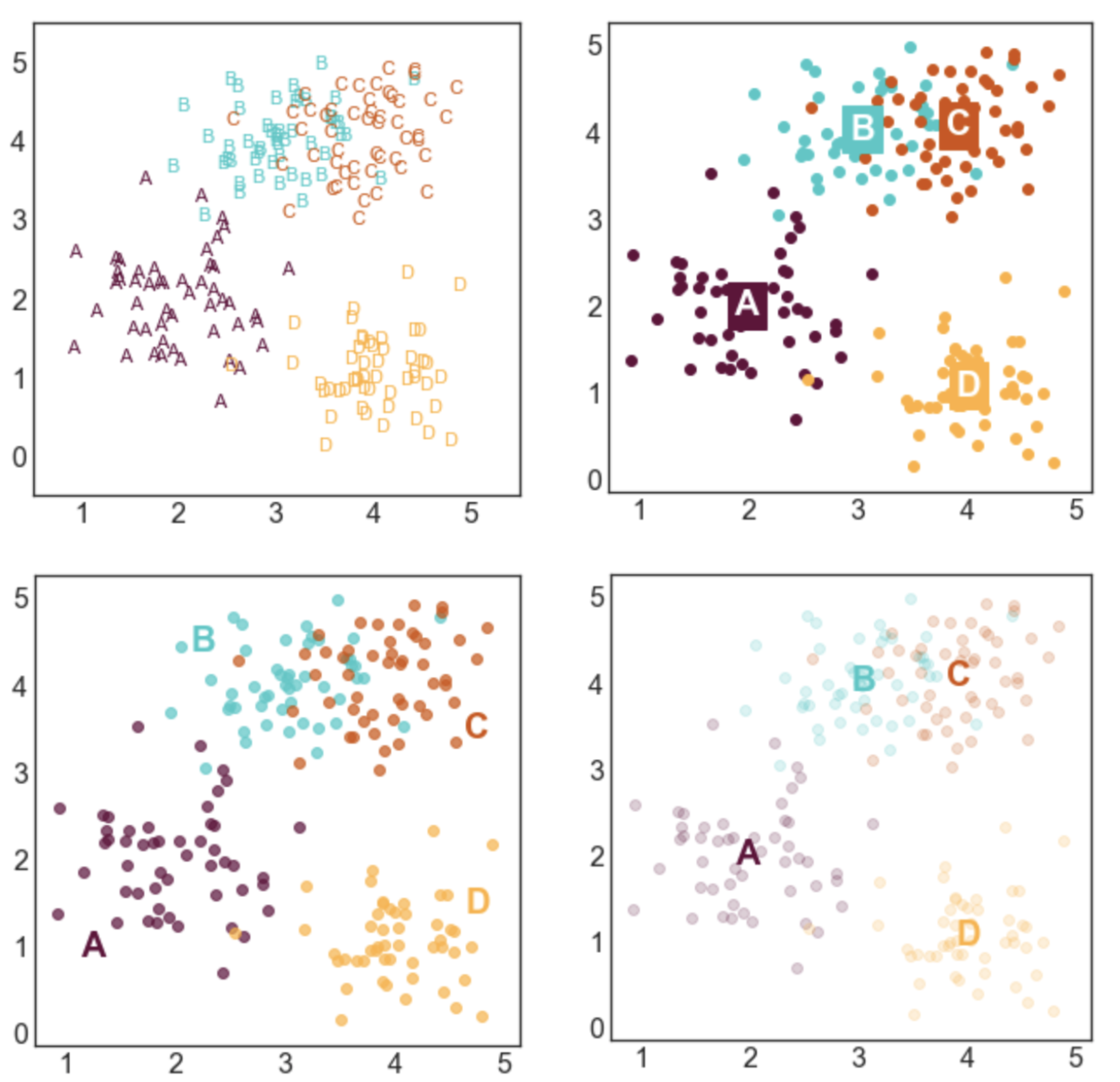
Here's a sneak peek of some of the plots:
You can access the Juypter notebook I used to create the plots here. I also embedded the code below.
First, we need to import a few libraries and define some basic formatting:
import pandas as pd
import numpy as np

import seaborn as sns
import matplotlib.pyplot as plt
%matplotlib inline

#set font size of labels on matplotlib plots
plt.rc('font', size=16)

#set style of plots
sns.set_style('white')

#define a custom palette
customPalette = ['#630C3A', '#39C8C6', '#D3500C', '#FFB139']
sns.set_palette(customPalette)
sns.palplot(customPalette)
CREATE LABELED GROUPS OF DATA
Next, we need to generate some data to plot. I defined four groups (A, B, C, and D) and specified their center points. For each label, I sampled nx2 data points from a gaussian distribution centered at the mean of the group and with a standard deviation of 0.5.
To make these plots, each datapoint needs to be assigned a label. If your data isn't labeled, you can use a clustering algorithm to create artificial groups.
#number of points per group
n = 50

#define group labels and their centers
groups = {'A': (2,2),
          'B': (3,4),
          'C': (4,4),
          'D': (4,1)}

#create labeled x and y data
data = pd.DataFrame(index=range(n*len(groups)), columns=['x','y','label'])
for i, group in enumerate(groups.keys()):
    #randomly select n datapoints from a gaussian distrbution
    data.loc[i*n:((i+1)*n)-1,['x','y']] = np.random.normal(groups[group],
                                                           [0.5,0.5],
                                                           [n,2])
    #add group labels
    data.loc[i*n:((i+1)*n)-1,['label']] = group

data.head()
STYLE 1: STANDARD LEGEND
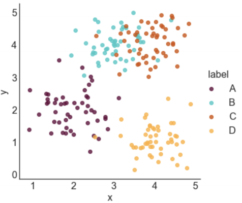
Seaborn makes it incredibly easy to generate a nice looking labeled scatter plot. This style works well if your data points are labeled, but don't really form clusters, or if your labels are long.
#plot data with seaborn
facet = sns.lmplot(data=data, x='x', y='y', hue='label',
                   fit_reg=False, legend=True, legend_out=True)
STYLE 2: COLOR-CODED LEGEND
This is a slightly fancier version of style 1 where the text labels in the legend are also color-coded. I like using this option when I have longer labels. When I'm going for a minimal look, I'll drop the colored bullet points in the legend and only keep the colored text.
#plot data with seaborn (don't add a legend yet)
facet = sns.lmplot(data=data, x='x', y='y', hue='label',
                   fit_reg=False, legend=False)

#add a legend
leg = facet.ax.legend(bbox_to_anchor=[1, 0.75],
                         title="label", fancybox=True)
#change colors of labels
for i, text in enumerate(leg.get_texts()):
    plt.setp(text, color = customPalette[i])
STYLE 3: COLOR-CODED TITLE
This option can work really well in some contexts, but poorly in others. It probably isn't a good option if you have a lot of group labels or the group labels are very long. However, if you have only 2 or 3 labels, it can make for a clean and stylish option. I would use this type of labeling in a presentation or in a blog post, but I probably wouldn't use in more formal contexts like an academic paper.
#plot data with seaborn
facet = sns.lmplot(data=data, x='x', y='y', hue='label',
                   fit_reg=False, legend=False)

#define padding -- higher numbers will move title rightward
pad = 4.5

#define separation between cluster labels
sep = 0.3

#define y position of title
y = 5.6

#add beginning of title in black
facet.ax.text(pad, y, 'Distributions of points in clusters:',
              ha='right', va='bottom', color='black')

#add color-coded cluster labels
for i, label in enumerate(groups.keys()):
    text = facet.ax.text(pad+((i+1)*sep), y, label,
                         ha='right', va='bottom',
                         color=customPalette[i])
STYLE 4: LABELS NEXT TO CLUSTERS
This is my favorite style and the labeling scheme I use most often. I generally like to place labels next to the data instead of in a legend. The only draw back of this labeling scheme is that you need to hard code where you want the labels to be positioned.
#define labels and where they should go
labels = {'A': (1.25,1),
          'B': (2.25,4.5),
          'C': (4.75,3.5),
          'D': (4.75,1.5)}

#create a new figure
plt.figure(figsize=(5,5))

#loop through labels and plot each cluster
for i, label in enumerate(groups.keys()):

    #add data points
    plt.scatter(x=data.loc[data['label']==label, 'x'],
                y=data.loc[data['label']==label,'y'],
                color=customPalette[i],
                alpha=0.7)

    #add label
    plt.annotate(label,
                 labels[label],
                 horizontalalignment='center',
                 verticalalignment='center',
                 size=20, weight='bold',
                 color=customPalette[i])
STYLE 5: LABELS CENTERED ON CLUSTER MEANS
This style is advantageous if you care more about where the cluster means are than the locations of the individual points. I made the points more transparent to improve the visibility of the labels.
#create a new figure
plt.figure(figsize=(5,5))

#loop through labels and plot each cluster
for i, label in enumerate(groups.keys()):

    #add data points
    plt.scatter(x=data.loc[data['label']==label, 'x'],
                y=data.loc[data['label']==label,'y'],
                color=customPalette[i],
                alpha=0.20)

    #add label
    plt.annotate(label,
                 data.loc[data['label']==label,['x','y']].mean(),
                 horizontalalignment='center',
                 verticalalignment='center',
                 size=20, weight='bold',
                 color=customPalette[i])
STYLE 6: LABELS CENTERED ON CLUSTER MEANS (2)
This style is similar to style 5, but relies on a different way to improve label visibility. Here, the background of the labels are color-coded and the text is white.
#create a new figure
plt.figure(figsize=(5,5))

#loop through labels and plot each cluster
for i, label in enumerate(groups.keys()):

    #add data points
    plt.scatter(x=data.loc[data['label']==label, 'x'],
                y=data.loc[data['label']==label,'y'],
                color=customPalette[i],
                alpha=1)

    #add label
    plt.annotate(label,
                 data.loc[data['label']==label,['x','y']].mean(),
                 horizontalalignment='center',
                 verticalalignment='center',
                 size=20, weight='bold',
                 color='white',
                 backgroundcolor=customPalette[i])
STYLE 7: TEXT MARKERS
This style is a little bit odd, but it can be effective in some situations. This type of labeling scheme may be useful when there are few data points and the labels are very short.
#create a new figure and set the x and y limits
fig, axes = plt.subplots(figsize=(5,5))
axes.set_xlim(0.5,5.5)
axes.set_ylim(-0.5,5.5)

#loop through labels and plot each cluster
for i, label in enumerate(groups.keys()):

    #loop through data points and plot each point
    for l, row in data.loc[data['label']==label,:].iterrows():

        #add the data point as text
        plt.annotate(row['label'],
                     (row['x'], row['y']),
                     horizontalalignment='center',
                     verticalalignment='center',
                     size=11,
                     color=customPalette[i])


