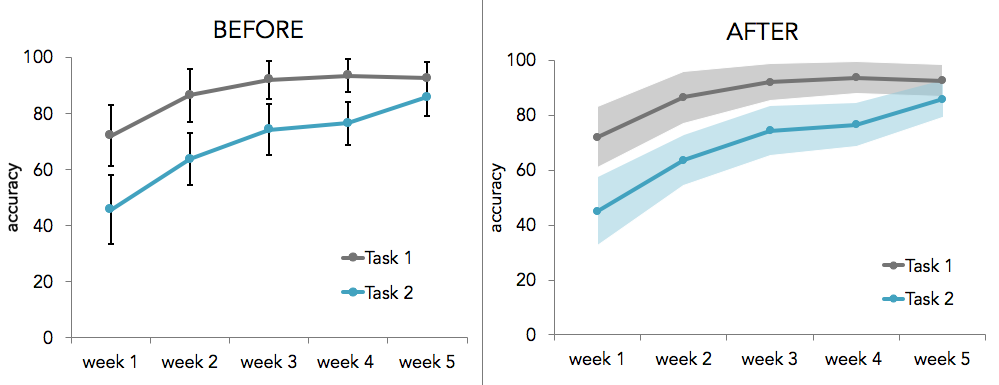
This tutorial describes how to create error bands or confidence intervals in line graphs using Excel for Mac. Excel has a built-in capability to add error bars to individual time points in a time series, but doing so can make the graph look messy and can conceal the overall shape or trend of the time series’ error. Shaded error bands provide good estimates of uncertainty without distracting from the time series. Creating error bands in Excel isn’t as straight forward as creating individual error bars — but never fear, this tutorial will show you how.
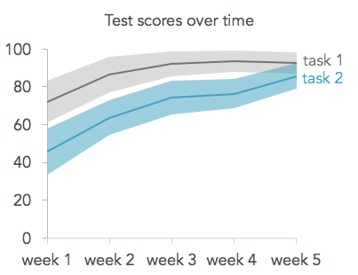
Here’s an sneak-peek of a two time series and their associated shaded error bands:
STEP 1: FORMAT YOUR DATA
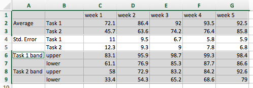
First, you’ll need to organize your data according to the following format:

The rows should contain the averages and uncertainty measurements associated with each condition and the columns should contain measurements over time. In the example above, I use standard error but you could also use a confidence interval, standard deviation, variance, or any other measurement of uncertainty.
Below the rows containing the averages and standard deviations, we will add additional rows for the upper and lower bound of each error band.
STEP 2: FIND THE UPPER AND LOWER BOUNDS OF EACH ERROR BAND
To find the upper bound of an error band, simply add the error to the average. So in our example, I added the average (cell C2) and the standard error (cell c4).
Similarly, subtract the error from the average to find the lower bound. In this example, I subtracted the standard error (cell c4) from the average (cell C2).
Find the upper and lower error bound for every time series in your data. Finally, apply the formatting to the other columns by highlighting the cells containing the upper and lower error bounds, and dragging the blue square on the bottom right of the box across the rest of your data columns.

STEP 3: GRAPH THE TIME SERIES
Select the time series averages and then click the option key and select the error band data too:
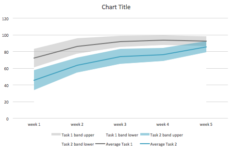
Create a line graph by clicking on the Charts tab in the Excel ribbon, clicking the Line icon under the Insert Chart area, and selecting the Marked Line plot. Switch the rows & columns of the chart by clicking the column button (the icon with the table and highlighted column) in the data section of the Charts ribbon. Next, remove the time series associated with the standard error by clicking on the lines and pressing delete. Your graph should look similar to this:

STEP 4: ADD THE ERROR BANDS
Right click on one of the lines associated with an upper or lower error band bound and select Change series chart type. Click the Area icon under the Change Chart Type section and select the Area plot. Repeat this step for every upper and lower bound. Now your graph should look like this:

For every lower bound:
- change the fill to white
- change the line color to white
- remove the shadow
For every upper bound:
- change the line color to “no fill”
- remove the shadow
- set the transparency to 50% (shape fill -> more fill colors... -> move the opacity slider to 50%)
- change the fill color to a lighter version of your time series color
Now your graph should look like this:
STEP 5: FORMAT THE GRAPH
Finally, remove the legend labels associated with the error bounds by selecting each label and pressing delete. Remove the grid lines by selecting a grid line and pressing delete. Format the graph to your liking. Here is an example of a fully formatted graph: